Creating optimal print layout/design strategy
Print Layout & Design
We were originally asked to create two print designs: a booklet and a magazine. Both had design constraints that needed to be followed.
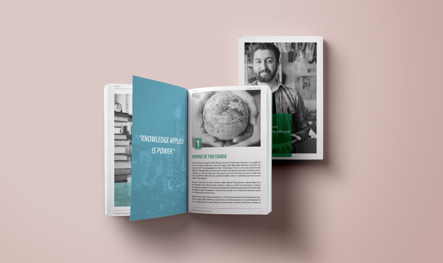
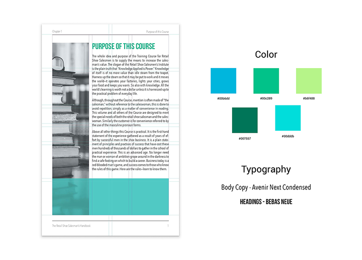
The Booklet was introduced as a design exercise to strengthen fundamentals in grid systems, typography, and paragraph styling. The brief required working within strict parameters: a 24-page maximum, use of black and white photography only, and consistent, professional typographic treatment.
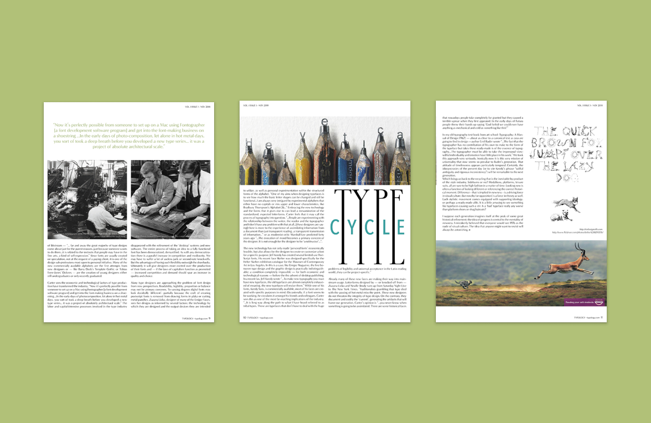
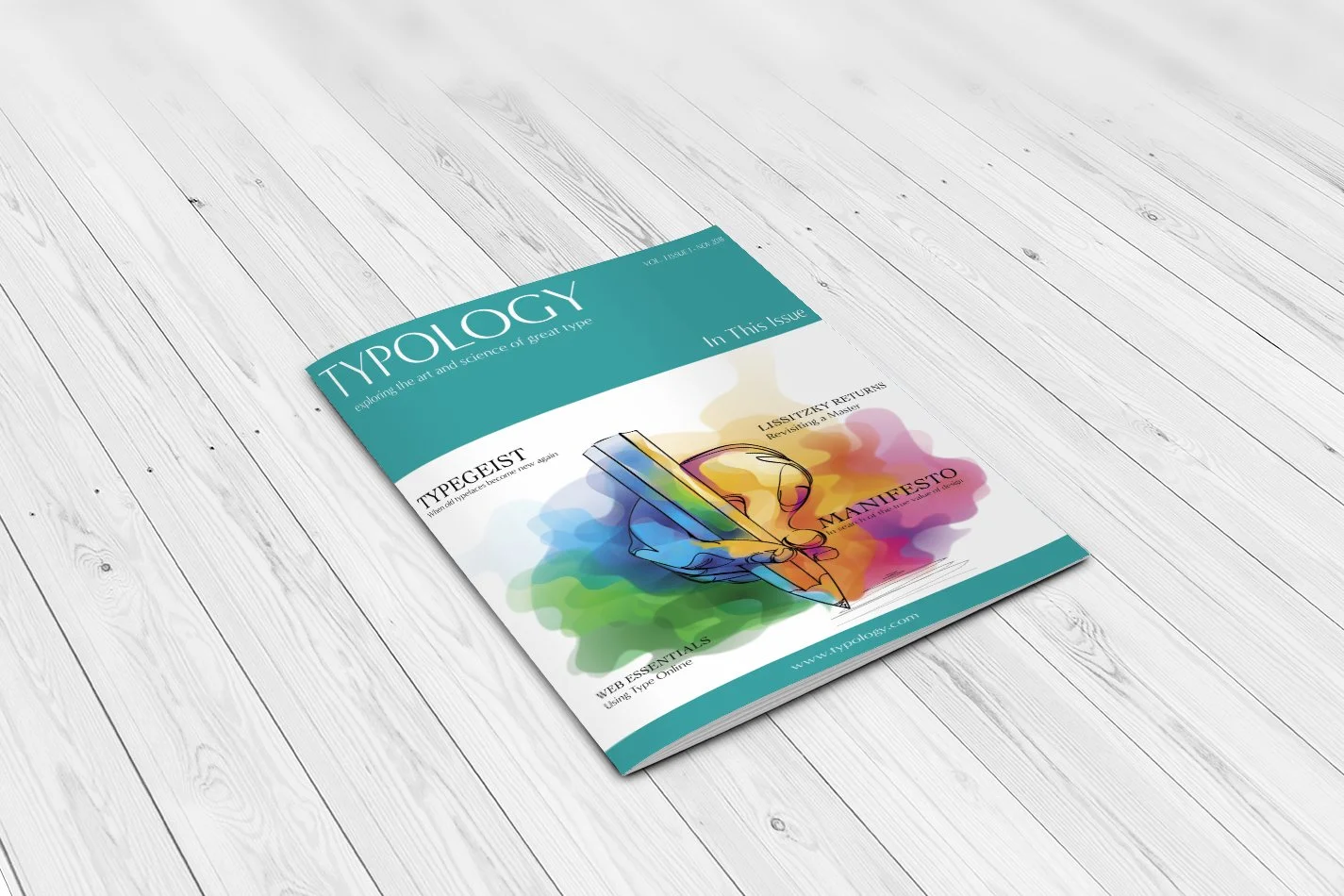
The Magazine needed to be focused on either typography or design. We were required to incorporate three articles and the rest was at our own discretion. I added 5 articles total plus advertisements. Goals for the project were to work with typography pairing and overall magazine layout.
Challenge
For the booklet, I adopted a three-column by five-row grid as the foundation for page layouts, then introduced an additional break at the midpoint of the second column and third row. This adjustment expanded placement options and allowed for a greater variety of balanced layouts while maintaining structural cohesion.
To elevate the black-and-white imagery, I leaned into a monochromatic color palette accented by bright highlights. This selective use of brightness enhanced the photos’ contrast and helped key visuals stand out without overwhelming the minimal aesthetic. Content was paced carefully across spreads: images and text were given equal weight, with shorter chunks of copy distributed evenly to avoid reader fatigue and encourage engagement with both visuals and written material.
For the magazine, I picked the colors green and blue to work with. I was aiming for a literary vibe mixed with the look and feel of a high end magazine. I felt like this color palette was bright and inviting yet still refined. My typography choices included Cochin for the titles and Minerva Modern for the magazine title, subtitles and body copy.
For the layout, I went with a modular grid that was three columns by three rows. I tried several unique layouts for image display as well. If you would like to view the complete magazine you can download the pdf here for further viewing.
Approach
Through the completion of these two projects, I advanced my skills with typography, grids and layout. I gained a better understanding with regards to successfully pairing type faces and increased my proficiency with grids and layout. Development of the booklet and magazine showcased my ability to design within constraints while applying thoughtful structure, hierarchy, and aesthetic choices to create an effective and engaging final product.
Results